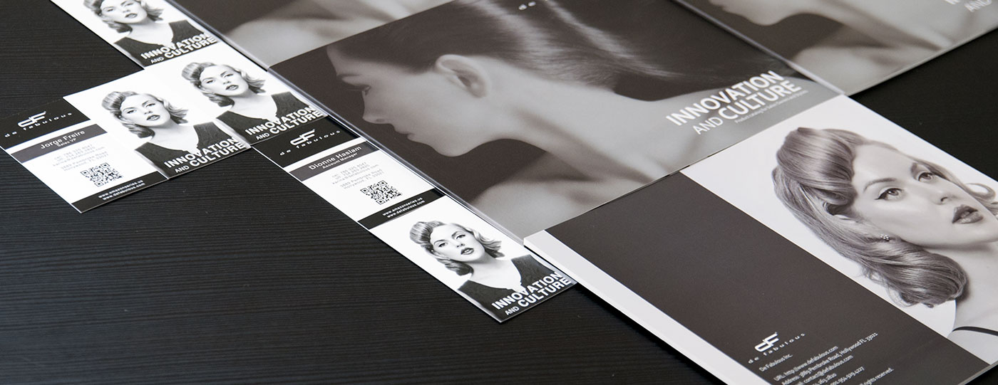
De Fabulous Rebrand

De Fabulous was looking for a consistent image across its marketing materials. A style guide was developed to establish rules and guidelines for future materials. This rebrand was based on the original direction, layout/typography were tweaked and more bold color accents were added to associate with the product lines.
Client: De Fabulous
Type: Graphics Design